"This work is a conscious attempt to literally interpret the pack content: 'One spoonful of sugar' - visually and verbally stated. Straightforward and simple, the pack design obviously invites to a more decorative daily cupper."
Agency: Mouse
Country: Greece
May 24, 2010
Prokrin
Mission: The image of Prokrin’s products was poorly differentiated and obsolete compared to its main competitors. This meant poor shelf impact. A restyling of the pack and logotype was necessary to improve visibility and memorability and to make the Brand more appealing. The aim was to clearly reaffirm the differentiating values of Prokrin: quality and price, at the same time as adding new attributes in line with young, fashion-conscious consumers.
Agency: CB’a Design Solutions
Country: Italy
Agency: CB’a Design Solutions
Country: Italy
Tags:
Cosmetic and Beauty,
Gel,
Hair,
Italy
May 22, 2010
May 9, 2010
May 4, 2010
EarBudeez headphones
"Audiovox found that customers choose their earbuds like a fashion accessory and packaging is key to their choice. JDA developed the earBudeez series as personalities with the earbuds as eyes in different positions to convey attitudes and emotions. These fun, eye-catching packages appeal to customers of all ages who want to express themselves with a unique product."
Agency: JDA
Country: USA
Agency: JDA
Country: USA
Tags:
Computer,
Innovation,
Technology,
Usa
May 3, 2010
Nature's Paper
"In Tetrea Pak packaging portfolio there are 9 different product families with more than 100 different sizes. The scope was to highlight the different possibilities and forces in the product families. Paper in all its forms has been photographed; confett, plated paper, paper bundles, unwrinkled paper, gold paper, fleas and paper shreds everything to create an inspired packaging portfolio for Tetra pak world wide."
Agenc: Amore
Country: Sweden
Tags:
Box,
Drink,
Innovation,
Juice,
Milk,
Sweden,
Typography
Resolution
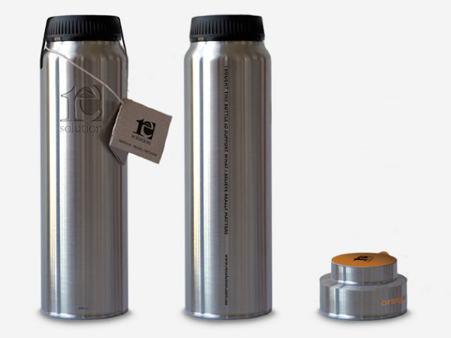
"This is a environmentally oriented and refillable water bottle with flavor refills. By screwing on the small flavour caps to the bottom of the bottle a sharp knife breaks the seal, which lets the flavour out and mixes it with the water. The idea is to make people carry one bottle around and use it over time instead of buying new plastic ones, for a one time use."
Designer: Hampus Jageland
Country: Australia
Tags:
Bottle,
Eco Friendly,
Fruit,
Juice,
Typography,
Water
Subscribe to:
Posts (Atom)


