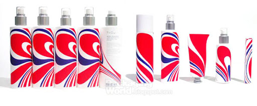
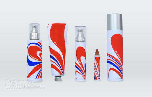
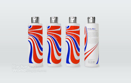
Lovely works from award winning Sweden based design studio Silver.


Country: Sweden
Thoughts?
Xococava (pronounced shoco-cava), an extension of its big brother restaurant, Cava, is whimsical hybrid of a stand-up tapas bar crossed with an ice-cream parlour. Inspired by Spanish and Mexican cultures of chocolate and Italy's love affair with geleto, Xococava features artisanal ice-cream and hand-made chocolate. With such unusual creations as prune/Pedro Ximenez sherry ice-cream and choriso, dark chocolate truffles, the store caters to Toronto's burgeoning "foodie" culture.
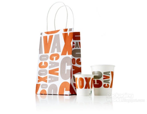
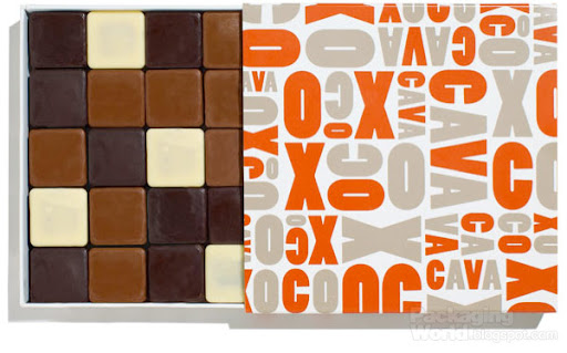
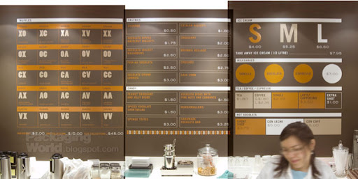
Agency: Concrete
Country: Canada
Via: Packaging UQAM

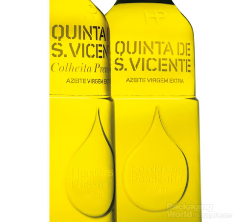
Thomas Berthon is an independent graphic designer working mostly for the wine sector in France.


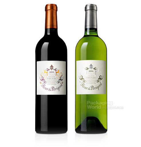
Designer: Thomas Berthon
Country: France
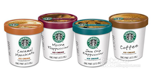
The line is now rolling into grocers across the U.S., and will be widely available by early spring. Imaginative ingredient combinations are sure to satisfy every palate.
“Our new ice cream line is an artful adaptation of some of our most popular hand-crafted beverages,” said Mary Theisen, director, business development, Starbucks Global Consumer Products. “We’re pleased to offer consumers a delicious and indulgent ice cream experience that is unmistakably Starbucks.”Consumers can easily recognize Starbucks® ice cream in the freezer aisle, thanks to a clean packaging design that mirrors the iconic white Starbucks® cup.Fresh wine packaging design from Hangar Studio. Coronado is a Premium Wine produced in Mendoza, Argentina, where the most famous and prestigious wineries of the world are located. Coronado is also the name of the eagle that lives in Mendoza. That is why the "Wine Eagle" is used as a brand icon.
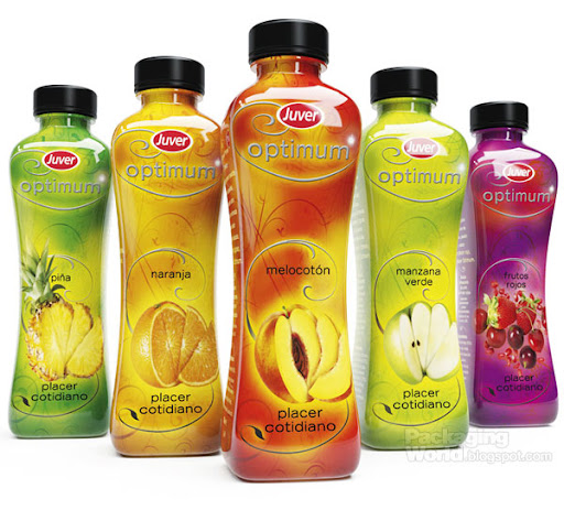
Jose Auso is a Graphic Designer based in Barcelona, Spain. Here is one of his recent packaging desings for Juver's Optimum Juice. Great example of 360˚ stretched packaging.
The Norwegian design agency, Strømme Throndsen Design, has developed the brand strategy, name, concept, packaging and visual identity of Holli Mølle Organic Flour .
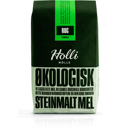
In creating the name, visual language and packaging for Holli Mølle, the following criteria were highlighted:
- The identity should be based on traditional and authentic values
- The packaging should be environmental friendly, functional, flexible and efficient in production.
- The identity should challenge the existing visual language in the flour category.
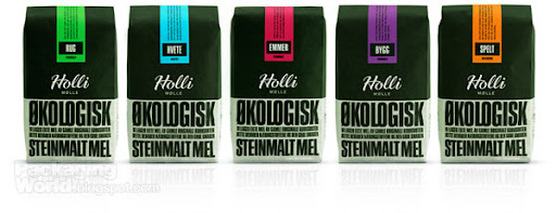
The result is a simple and unique graphical design, with fresh colours on the labels as the only differentiator between the 6 variants. The design communicates well with the target group, giving them a feeling that the flour really is ”ground with love”, as stated on the packaging in the personal message from the owner, Trygve Nesje.

Agency: Strømme Throndsen Design
Country: Norway
Experimental wine packaging concept by Nuria Herrero.
Three labels for three different qualities of this wine.
- Young wine (2008)Designer: Nuria Herrero
Country: Spain
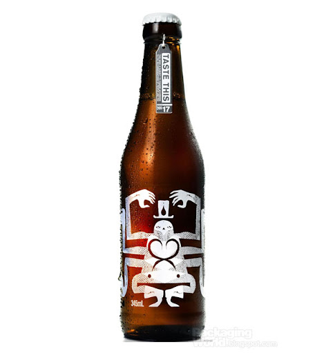
Melbourne-based marketing communications agency Taboo Group in conjunction with creative Sydney-based duo Webuyyourkids (Sonny Day & Biddy Maroney) last year launched the new great beer called Nelson in Australia.
Here is a story about the exciting rebrand:
“It’s been a long time coming, but the Trial Brew, also known as Batch #15, has finally been dubbed and officially launched. Trial Brew began its life in a plain bottle appearing as a silent sponsor of music, fashion, and art events during the latter months of 2008. At these events, as well as through a website and special information postcard, we gathered feedback from creative types (approximately 1,000 of them) regarding the look, taste, and possible names for the beer. This information was then collated in a neatly labelled ring binder and sent to our brewers and various other important people. After analysing this information the educated types made a few minor changes to Trial Brew, resulting in the Nelson we see today.
Agency: Taboo Group
Country: Australia
Via: PopSop

Holmes & Marchant has redesigned the packaging for iconic Kraft soft cheese brand Philadelphia.
The pack, which had remained virtually unchanged for the past 20 years, now has a brand new oval shape and illuminated graphics that centre on a brightened logo with images of fresh produce on the flavoured variants.
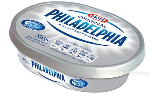
The new packs, which are on shelf from mid-April, feature a refreshed Philadelphia logo inside a burst of light, emphasising the fresh and wholesome qualities of the product. Flavoured varieties, such as basil and garlic & herb will also feature images of the ingredients around the bottom edge of the tub.
The new design also says goodbye to the traditional foil and transparent plastic covering in favour of an opaque plastic lid which will help to keep the product fresh and avoid contamination from other foods in the fridge.
The new designs will be extended across the Philadelphia range (including mini-tubs, Splendips and bricks) and will be rolled out across Europe. The revamped range is already in the process of launching across Belgium, the Netherlands and the Nordic region, and after April, will launch in Spain, Italy and Germany.
Paola Donelli and Sam Mitchell, the Kraft marketing leaders on the project said: “Coming up with this new look was a really exciting process for everyone at Philadelphia. The brand is well-loved across Europe and its packaging had an iconic look and appeal.
“We had to ensure that any new design paid homage to this, while communicating the fact that Philadelphia is a modern, innovative and wholesome brand. We’re delighted with the results that Holmes & Marchant has produced.”
Jon Davies, managing director of Holmes & Marchant added: “Philadelphia is a famous brand with a great heritage. We needed to create a pack that sympathetically moved the brand forward and reinforced its strong identity.
“Our aim was to create fresh, immediately understandable and intuitive pack architecture and graphics that worked across the whole range of products. The new shape makes the brand really stand out on shelf, while the design and logo communicate the freshness of Philadelphia.
Agency: Holmes & Marchant
Country: UK


![]()