Sep 15, 2010
Packaging World joins The Dieline!
I'm excited to announce to my valued readers that Packaging World is merging with The Dieline, the #1 Package design site. I will continue to blog as Senior Editor on The Dieline from now on!
Make sure you visit TheDieline.com to see my latest updates on the best packaging designs from all over the world!
Please keep sending me your best package designs at skucukaga(at)gmail.com
Aug 26, 2010
New Pepsi Raw
"Pepsi Raw is PepsiCo's biggest innovation for 20 years. No pressure, then... in order to appeal to an adult, sophisticated, urban market interested in a premium and more natural product, we produced a pared-back, elemental identity for 'the naked cola'."
Design: Ziggurat Brands
Country: UK
Aug 25, 2010
Packaging World on Twitter!
Packaging World is on Twitter! Follow Packaging world and stay up to date with the best packaging designs all over the world!
Twitter.com/PackageWorld
Jun 14, 2010
Beck Redesign
Pierini Partners designed Beck´s global packaging.
"After having competed against other European agencies, Adrián Pierini’s design was chosen by Anheuser Busch InBev marketing team from Belgium, to modernize the packaging.
Born in 1873 in Bremen, Germany, Beck’s mixes internationality and tradition, qualities that helped the beer to become the number one selling export beer.
The new layout highlights the visual elements that are a brand emblem, such as the key icon, phrases about its origin, medals, and its characteristic colors, red and black. All these were simplified and applied on a metalized support which adds modernity and freshness.
One of the most emphasizing details in the new packaging is the raise in the logo and icon importance. The icon was placed in the upper part in order to glorify the brand identity, which has been a synonym of quality and beer expertise for over a century.
Agency: Pierini Partners
Country: Argentina
Jun 1, 2010
EDAwards 2010 Packaging Design Winners
The European Design Awards is the comprehensive annual awards organization celebrating the best of graphic design, illustration and digital design in Europe. A joint effort by 14 communication design magazines from across Europe.
Here are the 2010 Packaging Design Winners:
Bendita Gloria 2010
2010 is the name of a wine to share with friends and celebrate the beginning of the new year. This product has been elaborated using organic farming methods without herbicides, pesticides or aggressive chemical filtrations. It's a limited numbered edition of 2010 bottles.
The label is a poster that wraps the bottle with the help of a rubber band without using adhesives. Once the wine is finished the bottle can be returned and the label has also a second life as a poster with this message about 2010: "Got the feeling it's gonna be a good year". Cheers!
Award: Gold
Country: Spain
Agency: Bendita Gloria
Økologisk steinbakt mel
Organic flour made from ancient grain types.
In the concept development process, the importance of making an environmentally friendly, functional, flexible and efficient packaging was highlighted. Also, the identity should challenge the existing visual language in the flour category. The result is simple and unique, with fresh colours on the labels as the only differentiator between the 6 variants. Premium flour ground with love.
Økologisk steinmalt mel = Organic stone-ground flour.
Vi lager ekte mel av gamle original kornsorter. Dette bevarer næringsstoffene og den gode smaken. = We produce real flour from ancient traditional grain types. This preserves the nutrients and the great taste.
Award: Gold
Country: Norway
Agency: Strømme Throndsen Design
Elyjah: Planet, Planet.
The Songs on Elyjah's debut album is both playful and atmospheric, it leaves a lasting impression. To ensure that that message was conveyed to the customer, we fired pellets at all two thousand covers. They circle like planets around a fixed point. Returning to a time in which men had morals in their hearts and cloth handkerchiefs in their trouser pockets, we put the band in Herr von Eden suits and then printed the large-format photos by hand. Typographically, we continued this theme with two typefaces from that time period: Memphis, from Emil Rudolph Weiß (1929) and the Wieynck Gotisch from Heinrich Wieynck (1926) were put into use on an old Heidelberg printing machine.
Award: Gold
Country: Germany
Agency: Zwölf
More award winners after the jump!
May 22, 2010
Apr 22, 2010
Puma and Yves Behar's new Green Shoebox Packaging
"It's hard to imagine something as simple as the shoebox being completely overhauled. But Puma and Fuseproject have done just that, in a design that will completely transform the brand's supply chain—saving millions in electricity, fuel, and water.
"Rethinking the shoebox is an incredibly complex problem, and the cost of cardboard and the printing waste are huge, given that 80M are shipped from China each year," Béhar tells FastCompany.com. "Cargo holds in the ships can reach temperatures of 110 degrees for weeks on end, so packaging becomes an enormous problem. This solution protects the shoes, and helps stores to stock them, while saving huge costs in materials."
After spending 21 months studying box fabrication and shipping, Fuseproject realized that any improvement to that already lean system would merely be incremental. So instead, the "clever little bag" combines the two packaging components of any shoe sale—the bag and the box—with high-tech ingenuity.
The bag tightly wraps an interior cardboard scaffolding—giving it shape and reducing cardboard use by 65%. Moreover, without that shiny box exterior, there's no laminated cardboard (which interferes with recycling). There's no tissue paper inside. And there's no throw-away plastic bag. The bag itself is made of recycled PET, and it's non-woven—woven fibers increase density and materials use—and stitched with heat, so that it's less manufacturing intensive.
The impact: Puma estimates that the bag will slash water, energy, and fuel consumption during manufacturing alone by 60%—in one year, that comes to a savings of 8,500 tons of paper, 20 million mega joules of electricity, 264,000 gallons of fuel, and 264 gallons of water. Ditching the plastic bags will save 275 tones of plastic, and the lighter shipping weight will save another 132,000 gallons of diesel.
The roll-out is planned for next year. After that? Hopefully, the design will become ubiquitous."
Via: TheDieline
Apr 19, 2010
Sierra Mist Redesign
"Pepsi has recently unveiled the new logo and packaging for their Sierra Mist brand—the lesser known ‘uncola.’
The lemon-lime-flavored soft drink has sure seen its fair share of brand makeovers during its relatively short ten year existence. Interestingly, the latest comes less than a year and a half after the previous attempt—which was launched alongside Pepsi’s infamous refresh and Tropicana flop (all designed by New York’s Arnell)."
Via Idsgn
Apr 7, 2010
Karl Lagerfeld Coca-Cola Light Bottle
"Coca-Coca Light the Lagerfeld way! This favorite drink of women has called upon the genius of Karl Lagerfeld to dress the Coca-Cola light aluminum bottle. The designer affixes his style and his famous silhouette on the bottle and delivers an exclusive creation with chic lines and also a unique box in limited edition, accompanied with a bottle-opener discreetly hidden in a drawer. The Coca-Cola light box by Karl Lagerfeld is the must-have of the season! On preview from April 24th !"
Via Juliapetit, Colette
See all Coke Designs on PackagingWorld!
Mar 19, 2010
Michael Osborne Archer Arms designs
![]() |
| Michael Osborne President and Creative Director of MOD |
Needless to say, it is universally accepted that it is unscrupulous to promote and present design work which was never actually produced, as if it were. It is also unethical to enter this work in design competitions, or publications and websites such as this one, especially when there is no text indicating the the nature of the work shown. These are comps of a design direction which was NOT chosen, and it was not "Designed by Tomorrow" as indicated...it came out of Temple and Brink before they disbanded 5 or 6 years ago, not June 11, 2009 as is listed above. Anyone who reads this should pass it on as a lesson in behavior that undermines our worthy craft and profession."
Here is Michael Osborne's current design direction as it appears in Target:
Mar 12, 2010
New Caribou Coffee Packaging & Identity
Agency: Colle+McVoy
Country: USA
Mar 10, 2010
Tom Gauld Diet Coke
Illustration by Tom Gauld.
Country: USA
Via CreativeReview
Mar 8, 2010
Chiquita Banana Brand Refresh
"Chiquita's latest ad campaign imbues its audience with an instant sense of wonder. Using playful illustrations on stickers juxtaposed to the iconic Chiquita stickers, the product and brand become more engaging to the consumer—plus they just look cool. We got a chance to ask the Art Director, DJ Neff, some questions about the process of making bananas (even more) fun."
Continue reading on Designrelated
Agency: The famous group
Country: USA
Dec 9, 2009
New Isostar
The specific consumer benefits “before/during/after sport” led the agency to graphically differentiate each sub-range for an instant understanding of the concept.
Cartoon Design is a french group, specializing in Packaging, based in Toulouse, Paris and Lyon."
Agency: Cartoon Design
Country: France
Nov 11, 2009
Burgopak
Agency: Burgopak
Country: UK
Oct 20, 2009
The Dieline Awards
TheDieline.com, The World's Leading Package Design Website, Launches The Dieline Awards, an International Design Competition Recognizing the World's Best Package Design:
• The first ever Dieline Awards, an international design competition recognizing best in package design, will be awarded in partnership with the FUSE Conference 2010!
• The official awards ceremony will be held at the FUSE Conference on April 14th, 2010, at Trump International Hotel & Tower in Chicago.
• 30 winners across 10 different categories will be awarded a prestegious Dieline Award, and one Best of Show winner will be chosen.
• The awards will be judged by a highly esteemed panel of 10 industry experts, and awarded based on quality of design. Debbie Millman, President of the AIGA and President of Design at Sterling Brands, will be the chairman of the judges, casting a tie-breaking vote in case of a tie.
• The top 10 winners and best of show winner will recieve a prize package worth over $4500, including the powerful Strata 3D CX Suite.
• A showcase of all award winning packaging designs will be opened at the show shortly after the winners are announced, and all winners will be featured in detail on The Dieline.
• Entry fees are $95 for the 1st entry, and $55 for each additional entry. There is also a discounted rate for student projects, $55 for each entry.
• All entries due by Monday Dec 21st, 2009.
For More Information and to enter the competition, visit TheDielineAwards.com. Good Luck!
Via TheDieline.com
Oct 12, 2009
Book Review / Boxed and Labelled
I just got a new packaging design book called "Boxed and Labelled" published by Gestalten. I loved the clean layout, great printing quality and lovely packaging designs examples of current packaging design trends. I'd just expect a better cover design but still it's one of the the best packaging books I've seen recently! The book document trends in the visual and graphic language of state-of-the-art packaging design and presents a comprehensive overview of the most intelligent, innovative, playful and attractive examples of current packaging design. I strongly recommend to every packaging professional to have it in their libraries!
Purchase on the publishers website
Purchase on Amazon
Boxed and Labelled: New Approaches to Packaging Design
Edited by R. Klanten, S. Ehmann
"Packaging is the face and visual identity of a product and can also be the crucial determining factor in the buying decision when a product is lined up on a crowded store shelf. As consumer tastes become more complex and culturally diverse, packaging increasingly requires a visual and graphic language that targets aesthetics as well as the needs of the discerning twenty-first-century shopper. Boxed and Labelled is a comprehensive overview of the most intelligent, innovative, playful and attractive examples of current packaging design.
The broad spectrum of packaging is illustrated through an extensive selection of products characterised by cutting-edge graphic design, sassy illustrations, striking typography, careful use of colour as well as unique materials. The examples in the book run the gamut from jam jars, chocolate wrappers, wine labels, champagne bottles and perfume flacons to sneaker boxes and shopping bags. The book also highlights extraordinary projects that have a unique approach to functionality, surplus value and sustainability, in addition to stimulating concepts that amount to pure seduction.
This book demonstrates the diverse solutions designers have found to deal with many different themes such as creating approachability through a whimsical and lighthearted appearance and material surfaces or promoting value and trustworthiness or conveying a handmade feeling to an artisanal product with a sophisticated, refined and purposeful look. All of the featured examples deliver their own unique brand values and experiences and set them apart in the competitive marketplace. Boxed and Labelled offers exciting solutions and presents state-of-the-art packaging design today"
May 19, 2009
EDAwards 2009 Packaging Design Winners
The European Design Awards is the comprehensive annual awards organization celebrating the best of graphic design, illustration and digital design in Europe. A joint effort by 14 communication design magazines from across Europe.
Here are the 2009 Packaging Design Winners:
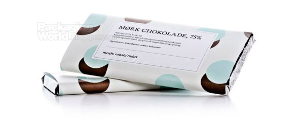
Moshi moshi mind
Result: Gold
Country: Denmark
Agency: Designbolaget
Andreas Caminada
Result: Gold
Country: Switzerland
Agency: Remo Caminada graphic design
Tcho Chocolate
Result: Gold
Country: Germany
Agency: Edenspiekermann
More award winners after the jump!
May 10, 2009
Sweet Freedom
Design company Holmes & Marchant has designed the packaging for cult fruit-based sweetener brand Sweet Freedom.
Agency: Holmes & Marchant
Country: UK
Related Posts: Holmes & Marchant Creates New Look for Philadelphia
Mar 27, 2009
ARLA Foods makes radical changes to the Milk Tetra Pak
Arla Foods makes radical change to milk carting due to Earth Hour 2009 on the 28 of March, 8.30pm. WWF stands behind this global event that will really change our minds, please turn of your lights too.
Via: Wearesuperfamous.com